View the Live Project
Check live gold and silver rates on Dhan Web
What’s Dhan?
Dhan is a technology-led stock trading platform built for India’s active market participants. The platform serves two distinct personas:
Super Traders: Who need speed, advanced charts, and F&O capabilities.
Long-Term Investors: Who focus on wealth creation through SIPs and IPOs.
Why build a Gold & Silver rates page?
Millions of Indians search Google for daily metal prices. Because Dhan didn't have a dedicated page for this, we were missing out on massive free traffic.
The goal was to build a clean price-checking tool to attract these searchers, earn their trust, and naturally introduce them to digital investing (ETFs/Mutual Funds) directly on Dhan.
Team
|
1 - Assistant Manager, SEO |
1 - Product Designer (Myself) |
|
2 - Engineers |
What’s the problem statement?
To check local rates before investing, people had to rely on clunky, ad-filled websites. Without a dedicated rates page, Dhan was losing millions of potential users right at the beginning of their research journey.
Why does this problem exist?
Modern investing platforms have a blind spot: they are built strictly for the final transaction, not the research phase. We only built tools for the stock market, completely ignoring how Indians naturally research physical metals before they buy digitally.
How does Dhan know this is a problem?
The Search Data: Millions of daily Google searches for "gold rate today" were going to our competitors or messy news sites.
The Drop-off: Existing users who wanted to buy Gold ETFs had to minimize our app, Google the physical rate, and come back. That context switch is where we lost people.
Why should Dhan solve for it?
For the User (Utility): It provides a beautifully clean, ad-free, and highly accurate single source of truth that saves them time and frustration.
For the Business (Growth): It creates a massive, free SEO traffic engine that naturally introduces millions of casual searchers to Dhan's investing products.
Who are we solving for?
The Everyday Researcher (Top of Funnel): People checking daily prices out of habit or before visiting a jeweler.
The Traditional Saver (Conversion Target): Buyers of physical metal who are prime candidates to switch to digital ETFs.
The Dhan Investor (Retention Target): Existing users checking baseline market prices before trading on our app.
What are the non-negotiable rules?
The Price is the Hero: The live number must be the biggest, boldest element. No hunting required.
Total Transparency: Show exactly when the data was last updated.
Progressive Disclosure: Show the answer first. Hide complex charts and heavy text until the user scrolls.
Helpful, Not Pushy: Any prompt to invest must feel like a natural next step, not a pop-up ad.
Defining Core Experience
Gold and Silver rates India (main page)
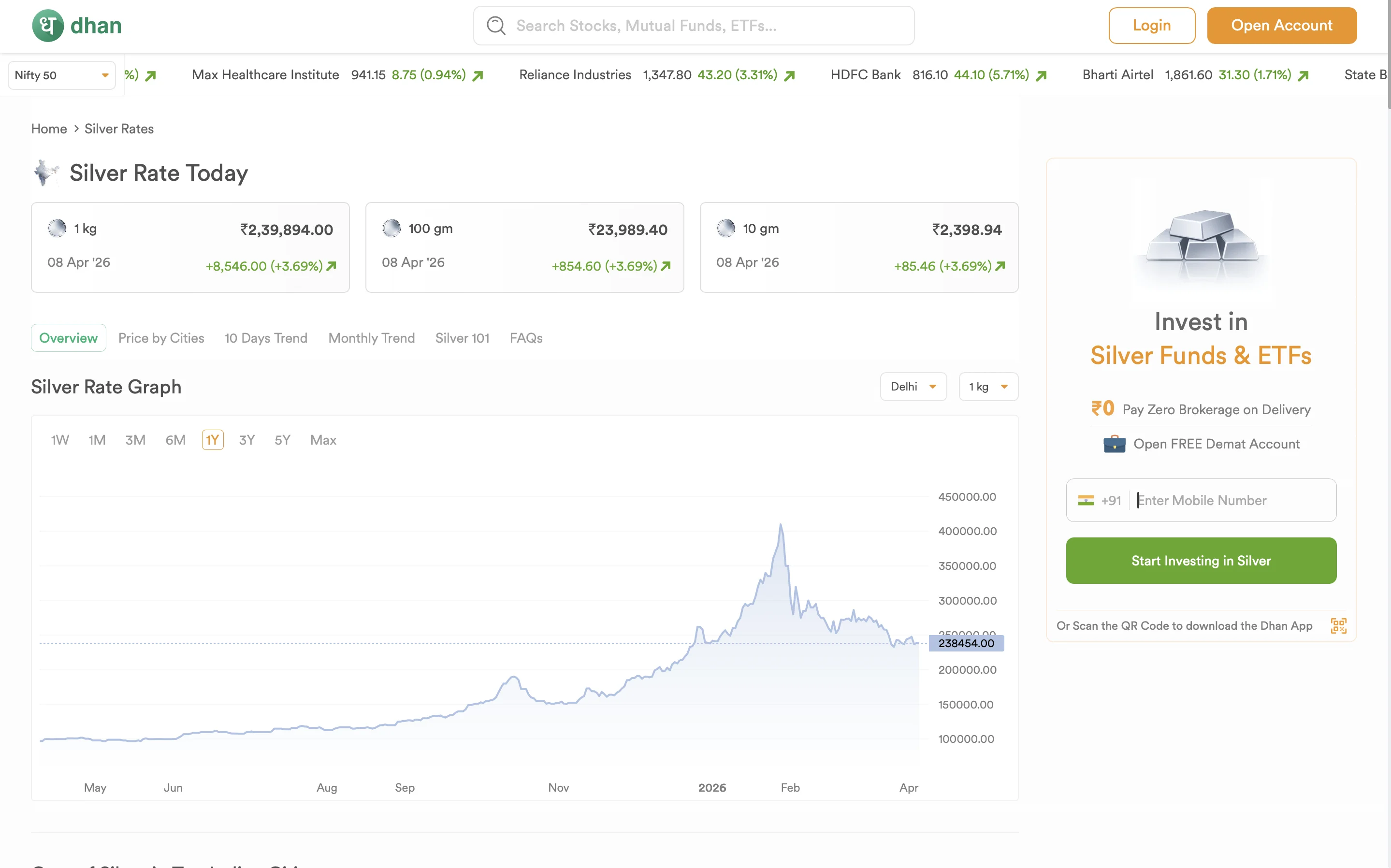
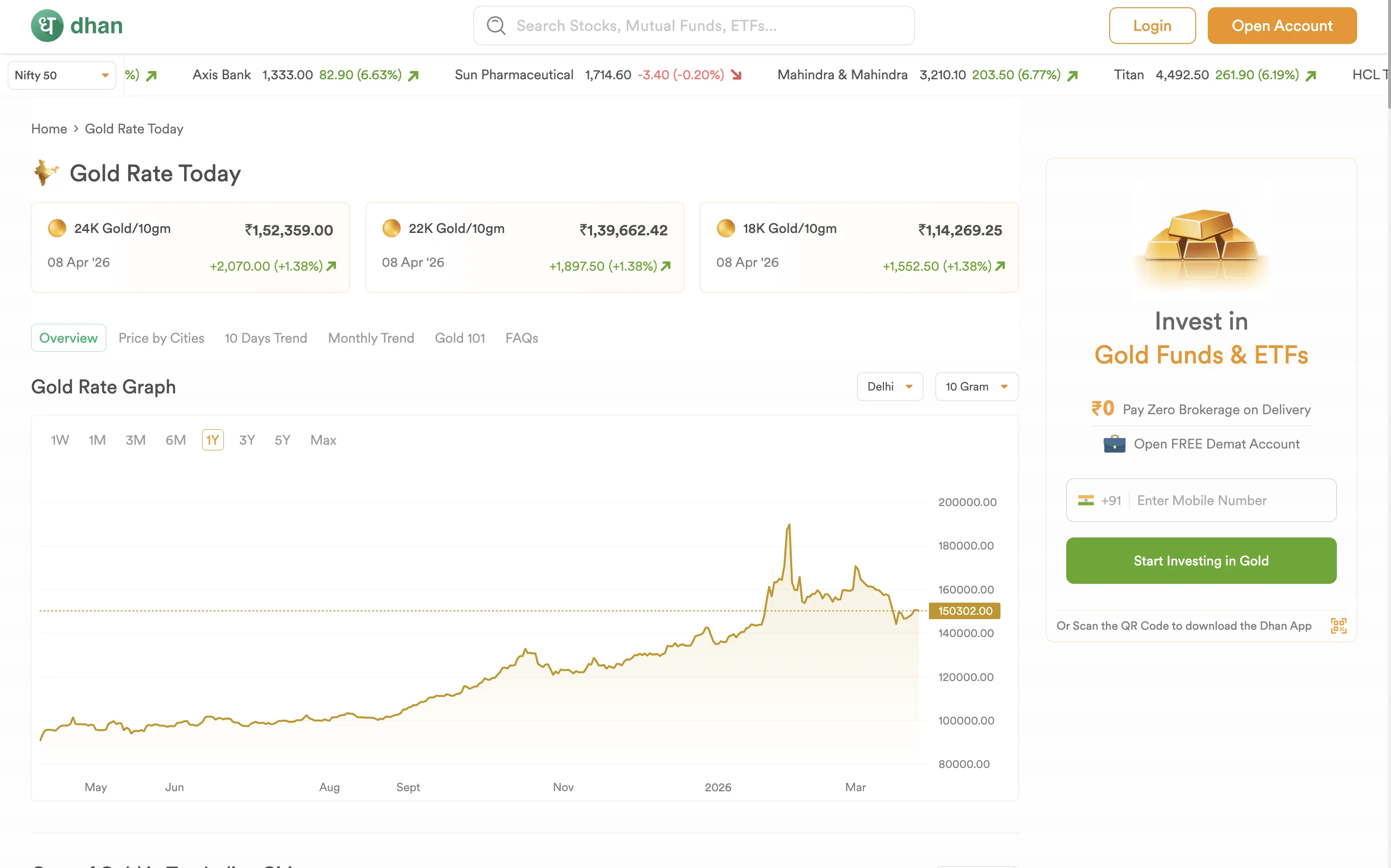
We built an experience that handles heavy data beautifully. Clean prices sit on the left, a sticky "Invest" widget follows you on the right, and interactive charts put the user in control all optimized for a flawless mobile experience.
Why the Prices Shrink on Scroll?
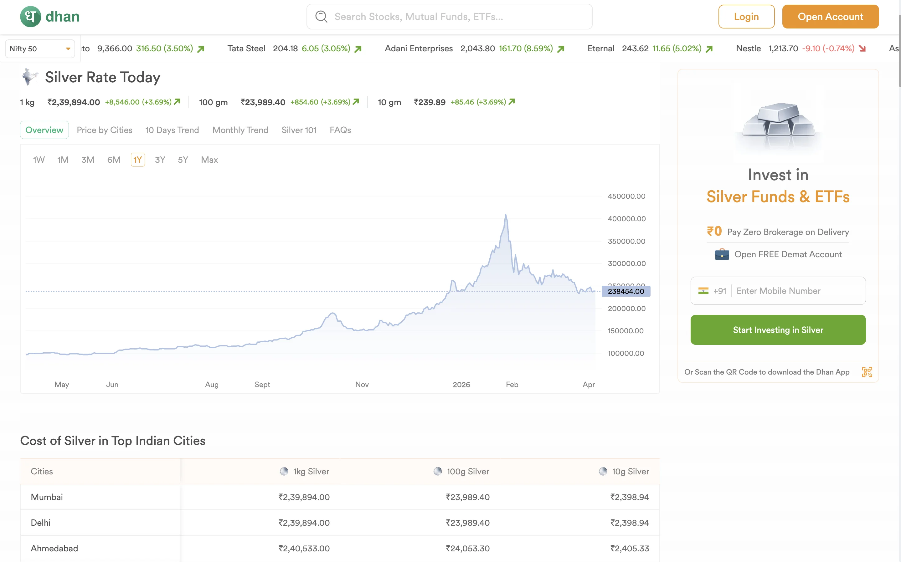
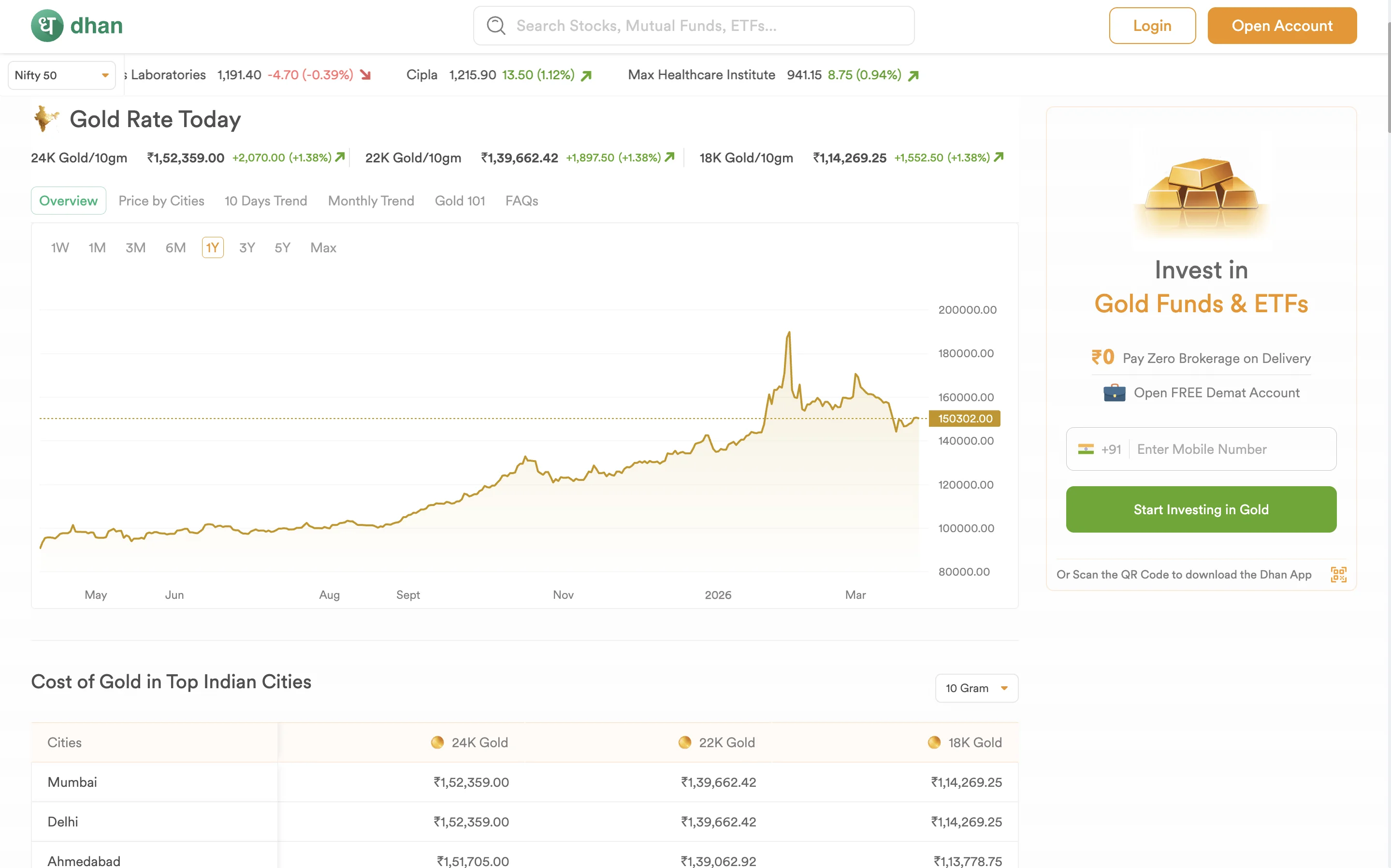
To give maximum screen space to the complex charts while keeping the main price visible as a slim, sticky header so the user never loses context.
The Live Price Cards


Placed at the very top for instant gratification. The user gets their answer immediately without scrolling.
The Trend Chart
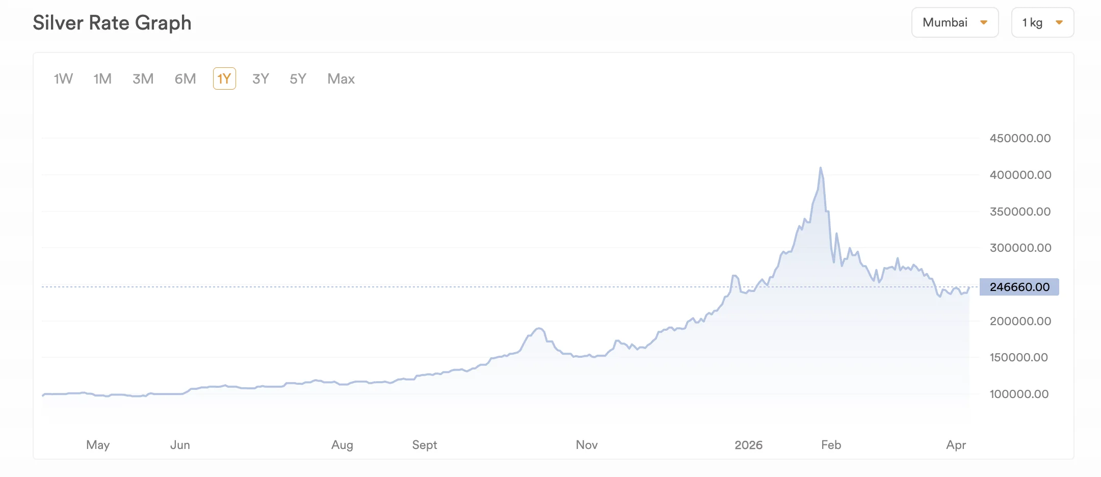
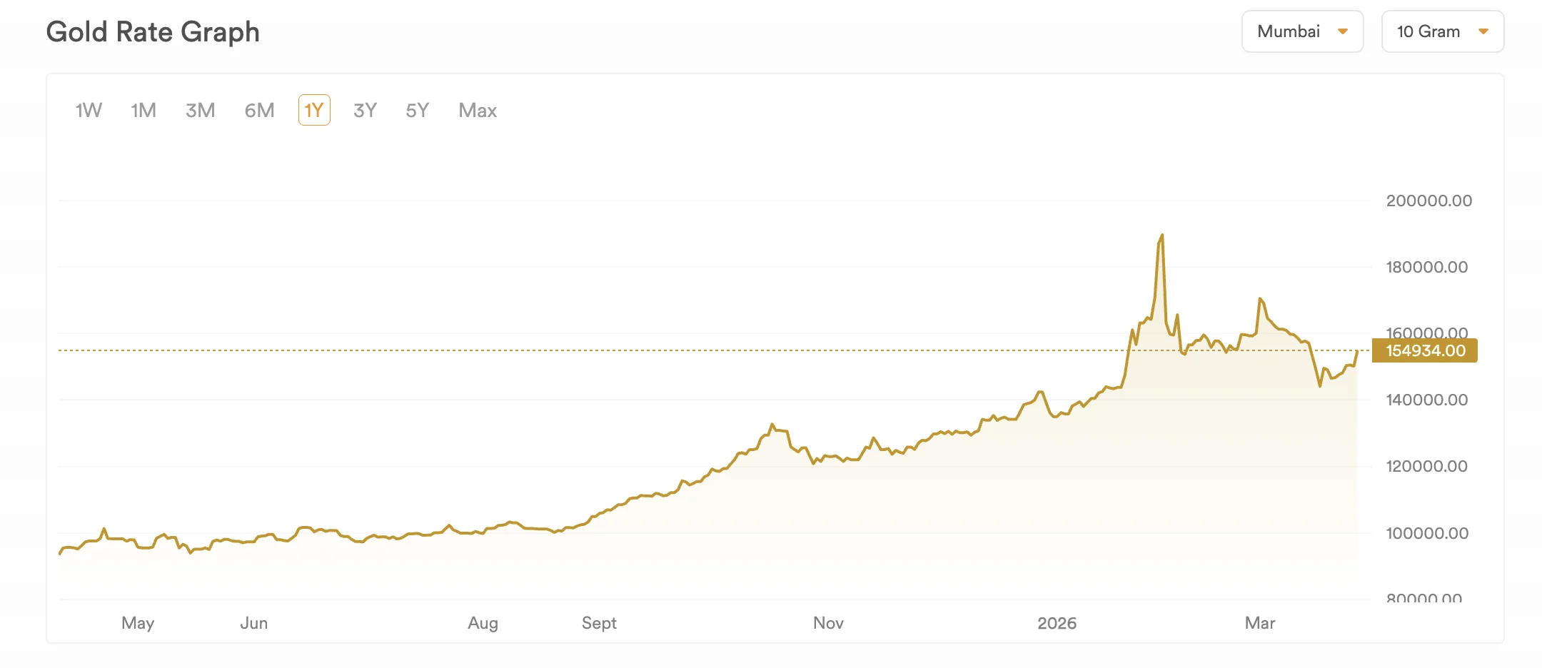
Turns raw numbers into a visual story, helping buyers instantly see if they are buying at a peak or a dip.
City-Wise Prices
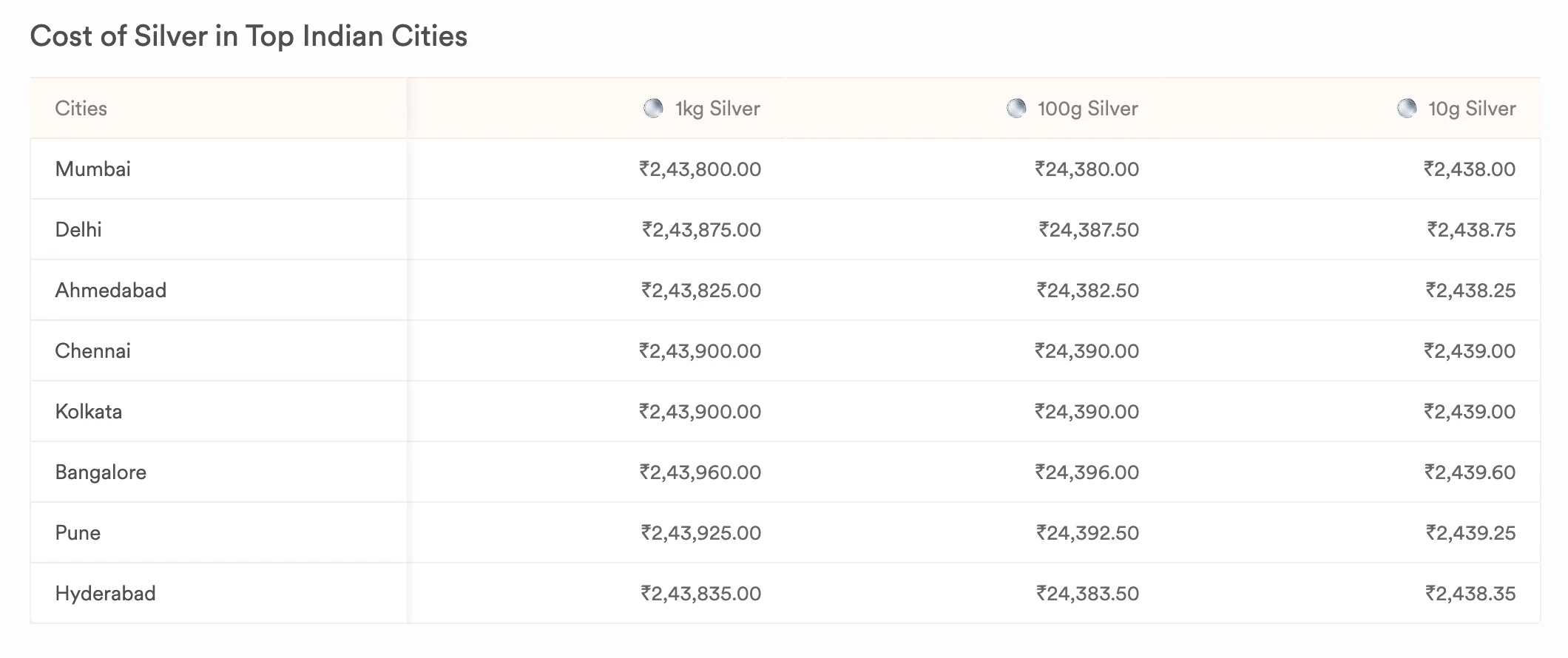
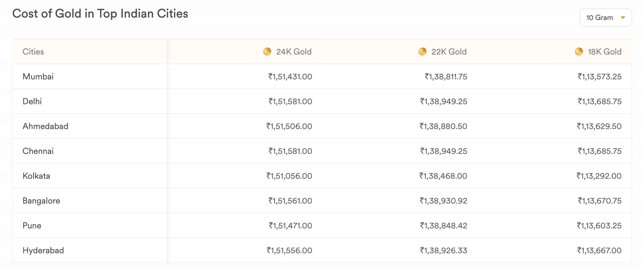
Physical rates change based on local taxes. This table makes the page hyper-relevant to the user's exact location.
10-Day & Monthly Trend Tables
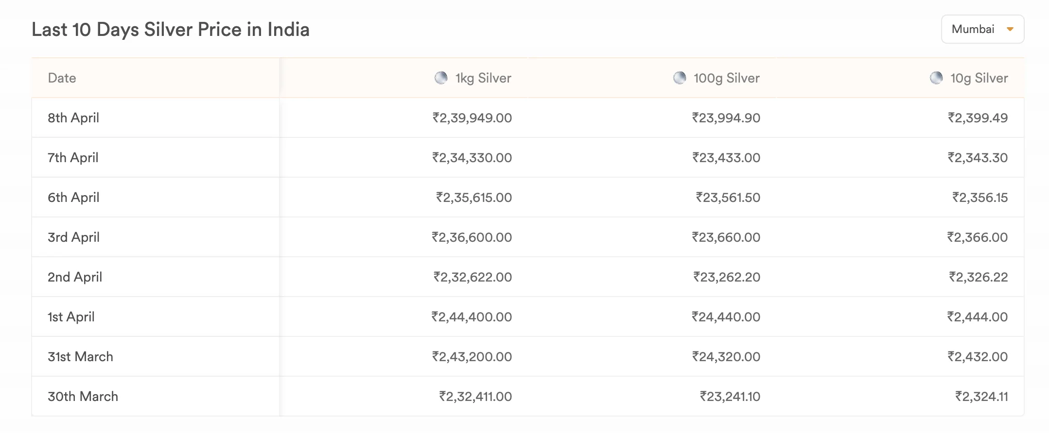
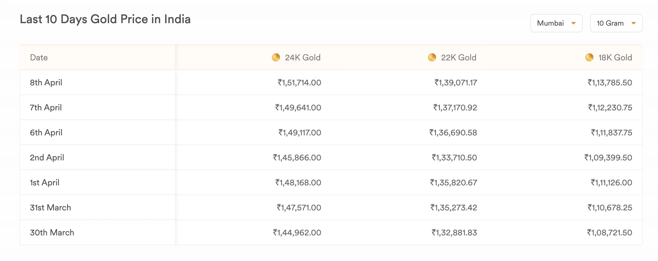
Built for serious buyers who prefer reading hard numbers over looking at graphs to spot short-term patterns.
The "101" / Education Module (SGBs, ETFs)
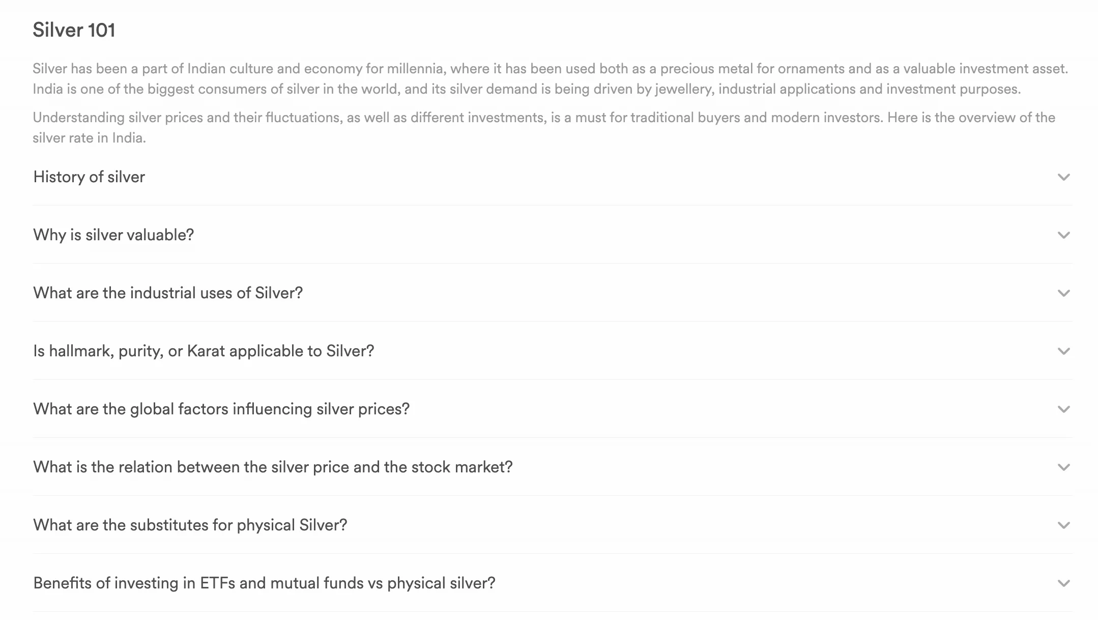
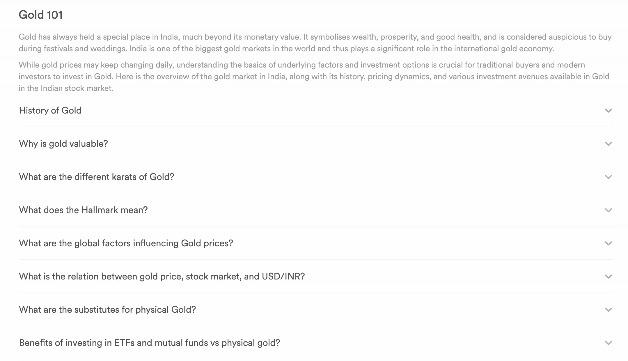
This is our business bridge. It transitions the user from "checking a price" to "discovering a better way to invest" (like ETFs or SGBs).
The FAQs
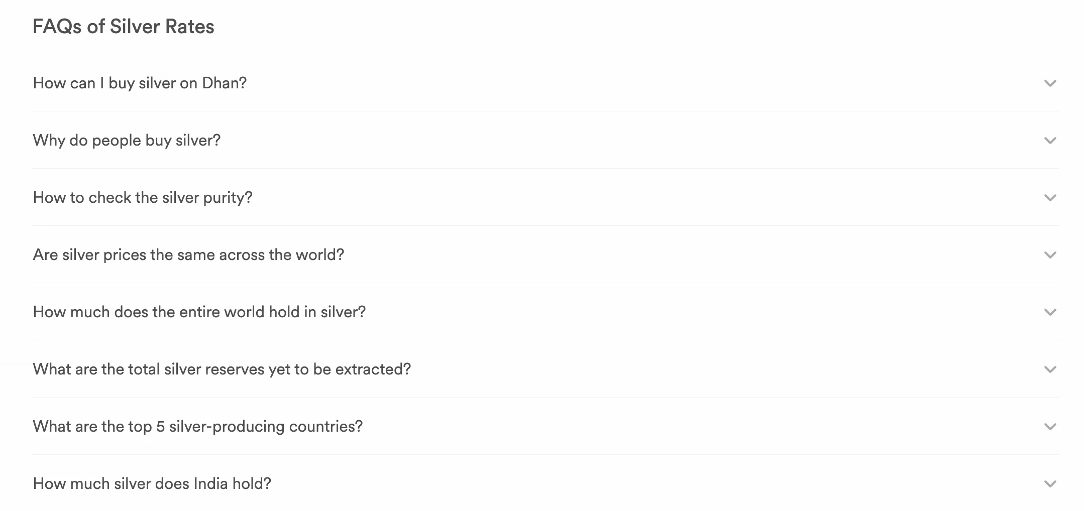
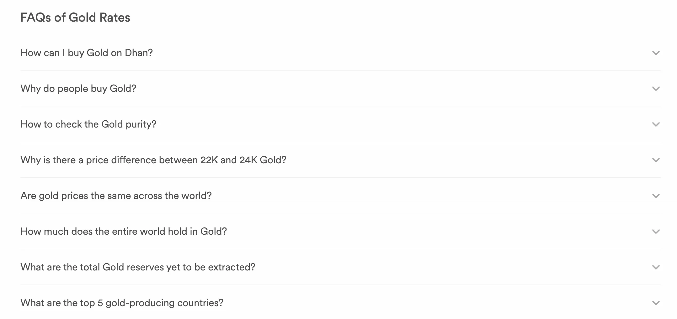
Placed at the very bottom to answer common doubts and give Google plenty of SEO text without ruining the clean visual design above.
The Strategy Behind the Priority Order
We designed for urgency: "Now" (Live Price) ➔ "Context" (Charts & Cities) ➔ "Next Steps" (Education & Investing).
The Power of Custom Local Icons

To make the data feel truly personal, we designed a unique set of 3D icons for every major city page, swapping out the generic map of India for local landmarks.
For Gold Pages: A golden Gateway of India for Mumbai, a golden India Gate for Delhi, etc.
For Silver Pages: The exact same landmarks, meticulously re-rendered in a premium silver finish.
Why it matters: It’s a small visual detail that packs a massive psychological punch. It instantly tells the user, "We didn't just give you a generic number; we calculated this specifically for your hometown." It transforms a sterile data page into a tailored, localized experience.
Early Performance Signals
Within just three months of launch:
The new pages hit nearly 2 million Google views.
7,400+ people actively checking prices clicked directly into our platform.
Jumped to an average position of 6.6 on Google search.
What I Learned
Treating search-engine landing pages with the same design rigor as our main trading terminal proved that offering high-quality, free answers is the strongest user acquisition strategy.
Brokerages speak in digital "tickers," but everyday people think in physical karats, grams, and city rates. Aligning the interface with the user's real-world vocabulary builds immediate credibility.